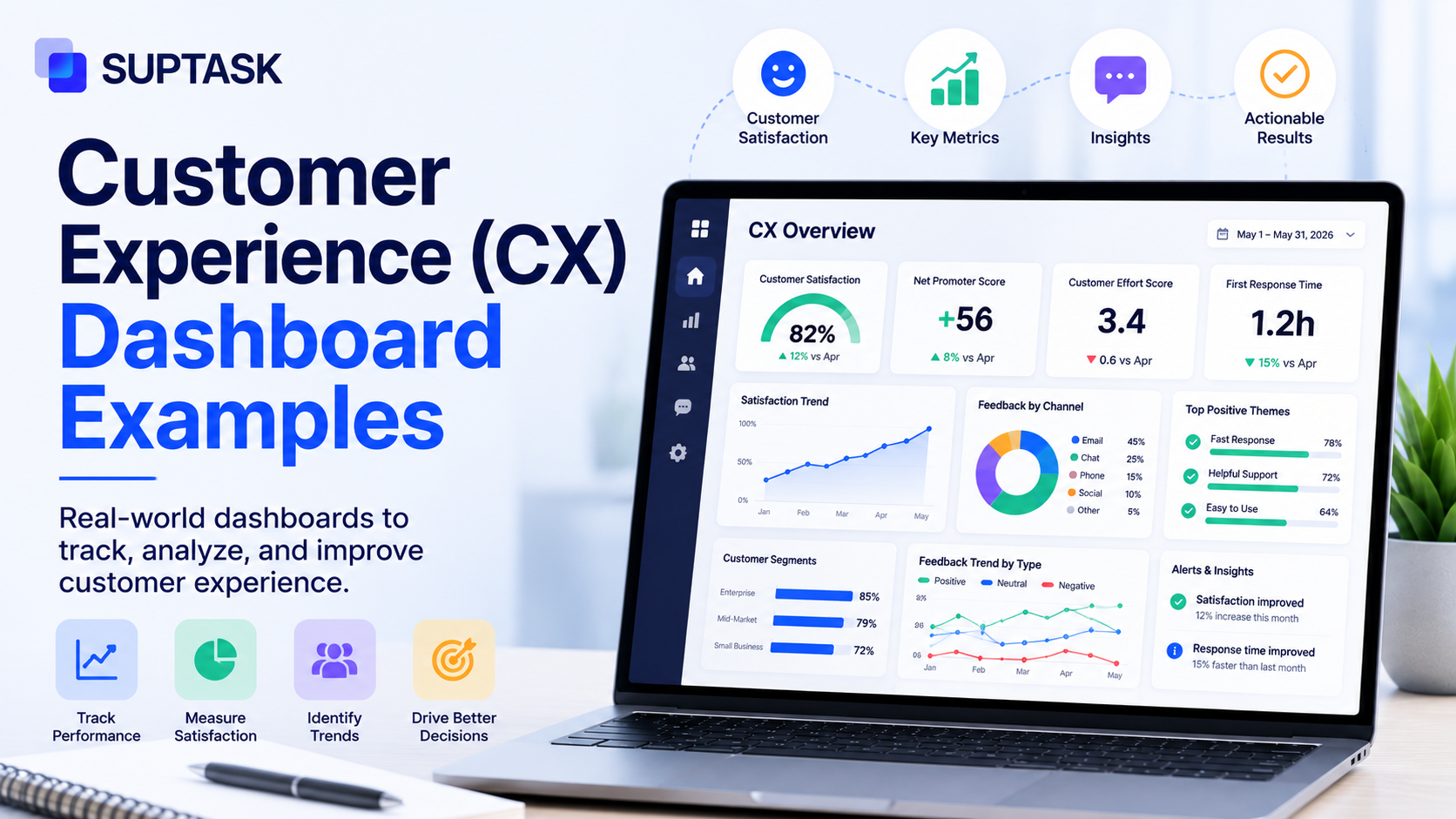
How do you know if your customers are actually happy with the experience you give them? A customer experience dashboard helps you see exactly by collecting metrics, feedback, and operational data into one visual workspace.
Different roles like executives, CX managers, support, success, and product teams need different dashboards. So in this post, we will go through six CX dashboards by role, what metrics go on each, and why they are laid out that way.
So, let's get started.
What is a customer experience dashboard?
A customer experience dashboard collects data from different sources and organizes it into one visualized view supporting decision-making. It pulls data from support tickets, survey responses, product analytics, and sentiment analysis, and brings all of it together rather than having it siloed across different tools.
Simply put, a customer experience dashboard helps decision-makers to have all the data they need to understand their customers, rather than going through five tools to have that understanding.
There are a few related dashboards that often get mixed up with it. A customer service dashboard is more operational and team-level, a customer success dashboard is account-level and focused on retention, and a CX dashboard is the broader one, often used at an executive or cross-functional level.
As every company has different roles, so does the dashboard they use.
Common KPIs and metrics on a CX dashboard
Every CX dashboard, irrespective of the team using have some of the common KPIs and metrics as discussed below:
- Perception metrics: It will help you know how customers feel about you. They are mostly customer engagement metrics like NPS (how likely they are to recommend you), CSAT (how satisfied they were with an interaction), CES (how much effort it took them), and sentiment scores pulled from their comments.
- Operational metrics: These help you know about the service delivery experience. They are the customer service metrics like first contact resolution (FCR), first response time (FRT), average handle time (AHT), ticket volume, and SLA compliance.
- Outcome metrics: These metrics include churn rate, customer lifetime value (CLV), retention, expansion revenue, and repeat purchase rate, which are the ones that tie experience back to the business.
6 customer experience dashboard examples by role
Here we have outlined 6 customer experience dashboards categorized by the roles that use them:
1. Executive CX dashboard
Who it's for: C-suite and VP-level leaders who read it monthly.
The question it answers: How does customer experience connect to business outcomes this quarter?
What's on it: A top row of scorecards (NPS trend, current CSAT, churn rate, and CLV). In the middle, a 12-month line chart of NPS laid over revenue retention. At the bottom, two bar charts, one comparing quarterly churn and one showing customer acquisition cost against CLV.
Why this layout works: It helps with a strategic view without any operational noise. Every metric on it connects back to a business decision, like renewing an account team's budget, escalating a product fix, or adjusting acquisition spend.
When to use it: It could be part of any CX program that reports to executives, and pretty much a must above mid-market.
What it doesn't tell you: It will help you know that the metrics are moving, but won’t help you with the reasons why they are moving.
2. CX manager/operations dashboard
Who it's for: The CX manager or director, read weekly.
The question it answers: Is the CX program healthy this week, and where should I focus?
What's on it: A top row with weekly NPS, weekly CSAT, and week-over-week ticket volume. The middle shows the sentiment trend, the positive, neutral, and negative split, over the past 30 days. The bottom has the top complaint themes from VoC tagging, and a list of accounts with negative survey responses that need a follow-up.
Why this layout works: It visualizes both strategic and operational data in both quantitative and qualitative themes.
When to use it: Any CX program that has a dedicated manager owning it.
What it doesn't tell you: How individual agents are performing.
3. Customer support team dashboard
Who it's for: The support manager and the agents themselves, read daily and often kept live during business hours.
The question it answers: Are you able to meet your service targets right now?
What's on it: Real-time numbers at the top, the current queue length, how many agents are available, and the age of the oldest unresolved ticket. The middle row has SLA compliance, FRT today against target, and FCR rate for the week. The bottom has a per-agent CSAT leaderboard and a list of escalations that need the manager.
Why this layout works: It is a real-time dashboard view that drives action during the day, like rebalancing the queue, escalating aging tickets, or recognizing the top performers.
When to use it: Any support team above five agents.
What it doesn't tell you: Whether the team is solving the right problems. A team can hit every SLA target and still fail the customer if the root-cause issues never make it back to the product, and that is what the VoC dashboard sees.
A note on Slack: Where the team already works in Slack, daily digests or threshold alerts, like the queue going over a set number or a ticket sitting too long, push the dashboard to the team instead of the team having to go and check it.
4. Customer success/account health dashboard
Who it's for: Customer success managers and the head of customer success. It is often read daily for at-risk accounts and weekly for the whole portfolio.
The question it answers: Which of my accounts need attention this week?
What's on it: Portfolio-level metrics at the top, gross retention, net retention, and expansion bookings. The middle is a sortable list of accounts colored by health score, green, yellow, or red, with the last activity date and the CSM who owns each. The bottom flags churn signals at the account level, like a drop in logins, a spike in support tickets, or an NPS detractor.
Why this layout works: It is account-first, not metric-first. The CSM works directly from the at-risk list instead of staring at aggregate scores.
When to use it: SaaS, subscription, or B2B businesses that have named accounts and CSMs. It can also be integrated with customer success tools.
What it doesn't tell you: Why accounts are at risk across the board. That pattern shows up on the VoC dashboard.
5. Voice of Customer (VoC) / feedback dashboard
Who it's for: The CX manager, product manager, and research lead, read weekly for themes and monthly for trends.
The question it answers: What the customers are saying, and what is changing.
What's on it: The top shows response volume by channel, in-product surveys, post-ticket CSAT, NPS surveys, review sites, and social mentions. The middle ranks the top tagged themes by volume, with the sentiment shift per theme over the past 30 days. The bottom carries sample verbatims by theme, a few representative quotes per category so the qualitative texture comes through.
Why this layout works: It is built to surface patterns, not single signals. Pairing the quantitative themes with real quotes keeps you from deciding on one loud anecdote, or from chasing numbers with no context behind them.
When to use it: Any organization collecting structured feedback, and it becomes essential once you are past roughly 50 feedback items a week.
What it doesn't tell you: Whether anyone is acting on the feedback. That is a routing problem, not a dashboard one, and it is covered in how to track customer feedback.
6. Product experience dashboard
Who it's for: The product manager, head of product, and CX manager, read weekly.
The question it answers: Where are customers struggling inside the product?
What's on it: The top shows active users, retention curves by cohort, and feature adoption rates for the key features. The middle has friction signals, drop-off rates at key funnel steps, error rates by screen, and support tickets tagged to specific features. The bottom shows in-product NPS or CSAT scores by feature or journey stage.
Why this layout works: It puts behavioral data, what users actually do, next to experience data, how they feel about it. That combination is where most product CX decisions get made.
When to use it: Any SaaS or digital product where the experience happens through software, which is most modern B2B and B2C.
What it doesn't tell you: What customers wanted to do but couldn't. For that, you need session replay or some qualitative research alongside it.
How to design an effective CX dashboard?
A CX dashboard is as good as the design behind it, so you can visually make sense out of the data. Each of the six examples above can act as a starting template you adjust to your own team, but whichever you start from, these five principles matter.
- One dashboard, one decision: Every dashboard should exist to drive one specific decision for one specific reader. If you cannot name the decision it helps with, then what you have is a report, not a dashboard.
- Match the cadence to the role: An executive dashboard is monthly, an operations one is real-time. If you build it for the wrong cadence, people either get flooded, or they check it too late, and either way it stops being useful.
- Pair quantitative with qualitative: A score on its own usually starts an argument, not an action, because nobody agrees on why it moved. Every NPS or CSAT number on the dashboard should have a quick path to the verbatims sitting behind it.
- Build action triggers, not just metrics: A simple threshold alert, like one that fires when CSAT drops below a set number, turns the dashboard from a record into a workflow. That is the difference between watching a number and actually doing something about it.
- Trim it aggressively: Most CX dashboards drift toward 20 or more widgets within six months. Do a quarterly clean-up, and if a widget has not driven a decision in the last 90 days, take it off.
Common mistakes in CX dashboard design
A few mistakes show up in CX dashboards over and over, and they are worth avoiding.
- Dashboard sprawl: You must focus on having the dashboards that add value, rather than having as many dashboards as you could.
- Vanity metrics: The metrics you track must be rated against a target because it tells you something you can act on. Pick the numbers that lead somewhere.
- No drill-down path: A dashboard that shows an NPS score but gives no way to see the comments behind it forces the analyst to leave the dashboard to do the actual work. The score and the reason should sit close together.
- Updated too late to matter: A daily dashboard running on data that is a week old is a report, not a dashboard. If people are making decisions on it, the data has to keep up with the cadence.
Most of these mistakes come from the same root, which is building the dashboard first and thinking about the decision later. So whenever you add a widget, a metric, or a new dashboard, check what decision it supports and who will act on it. If there is no clear answer, leave it out, because every extra widget makes the useful ones harder to see.
Frequently asked questions
What metrics should be on a CX dashboard?
It depends on the role using it, but most CX metrics fall into three groups. Perception metrics like NPS, CSAT, and CES show how customers feel. Operational metrics like FCR, FRT, and SLA compliance show how service delivery is going, and outcome metrics like churn, retention, and CLV show what customers do as a result. A good dashboard mixes the ones that matter for its reader, not all of them at once.
How many CX dashboards does a team need?
As many as there are distinct roles making decisions, which is usually a few, not one. A small team might run just a VoC and a support dashboard, while a larger CX program runs an executive, an operations, a success, and a product one. The goal is one dashboard per decision-maker, not a dashboard for every metric.
What's the difference between a CX dashboard and a customer service dashboard?
A customer service dashboard is operational and team-level, focused on things like queue length, response times, and SLA compliance. A CX dashboard is broader, pulling in feedback, perception, and outcome data across the whole experience, and it is often read at an executive or cross-functional level. The service dashboard is really one input into the bigger CX picture.
How often should a CX dashboard be reviewed?
It depends on the dashboard. An executive one is usually monthly, an operations one weekly, and a support one is checked daily or kept live during business hours. The rule is to match the review cadence to the decisions the dashboard drives, so the data is never older than the decision needs it to be.
What tools are commonly used to build CX dashboards?
A few categories of tools get used here. There are BI tools like Tableau and Looker, CX platforms like Qualtrics and Medallia, dedicated dashboard builders like Geckoboard, and the embedded analytics built into many CX and help desk tools. The right one depends on where your data already lives and how much you want to build versus buy.